Wednesday, 26 November 2014

My Photograph Idea

Investigate Ideas of Representation and Identity in Relation to Your Cultural Position in Society.

My initial idea of my project is to focus on the consumerism of food, in excessive amounts. I felt this is something that relates to society today with mass produced food and franchised food chains and so much of the media drawing to body image, diets and food habits.

As part of my project brief is Identity, I've decided to focus on an individual in each shot in a portraiture style composition, excessively eating mass produced junk food; burgers, hot dogs, sweets, chocolate, fizzy drinks, doughnuts, cakes, chips. I want to take influence from fashion photographers such as William Klein, David Bailey and John Rankin Therefore I'm going to express meaning of extreme superficiality which exists in the idea of materialism, often encouraged by advertisement and I'm going to achieve this by using strong saturated makeup like that seen in Rankin's work. Each model in the set of photographs will have different make up according to their food (by using a common colour scheme) touching on the idea 'You are what you eat'. The overall edited shots will have deep saturation of colours, as I feel this is important aspect to show superficial man-made aspect that exists in materialism. The model will be seen to be excessively eating food, to show the addictiveness of being a consumer; always having something to buy. And this and the model will be emphasised through a pastel pale background, echoing some of the photographers I researched earlier.

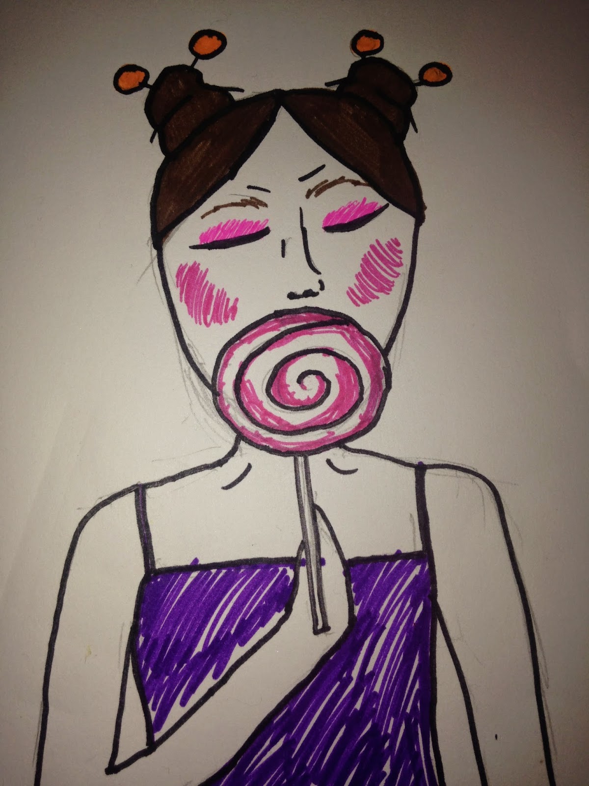
These are my first early sketched designs of how the photo's will look:

This photograph focusing on excessively eating burgers and make up design of the model which reflect this.


I then decided to take my initial idea for the Burger photograph and test the make up, to create a superficial saturated look which I will later use in the real shoot. My experimental test is shown here:


I feel the test was vital to make sure I got the right look and effect I was looking for. I do think it has a doll-like superficiality therefore I would consider the experiment a success and I will definitely use this in my final photograph.


Another one of my designs for the set of photographs focuses on the excessive eating of sweets:


I'm happy with this experiment too, it has helped me in giving me an understanding of what brushes I need to use to create clean cut lines (as I felt some of the lines here were too smudged). But I will definitely be using this look in my final shoot, as I feel it has the potential to symbolise a degree of superficiality, linking to my idea.

Another idea for one of the photographs in the set is excessively consuming fizzy drinks:

In this image I'm also considering to incorporate fizzy drink cans into the hair design.

My fourth shot in the set is planning to focus on the excessive eating of doughnuts:


My fifth shot in the set is planning to focus on the excessive eating of hotdogs:


My sixth shot in the set is planning to focus on the excessive eating of crisps/chips:


Tuesday, 25 November 2014

Project Research: Consumerism and The Consumerist

I've decided to look at consumerism and the consumerist as a form of social position in society and how this is represented. From a sociological perspective, the two basic views of consumerism is Marxist and Functionalist. Marxist's see the consumer as the hard worker-man who has been exploited into materialism, therefore benefiting the wealthy, whilst remaining worst off themselves. The other perspective, Functionalist, is more positive, believing consumerism and materialism is vital for society to run smoothly and for the economy. As you can see there is a deep contrast between views, therefore there is a deep contrast of representations and routes that can be explored throughout my photography project.

Definition:Consumerism is a social and economic order and ideology that encourages the acquisition of goods and services in ever-greater amounts.

As the definition of consumerism states it 'encourages the acquisition of goods and services in ever-greater amounts'. I think this is a key area I can focus on and explore the excessive amounts of consumerism today and the high emphasis on materialism today which is encouraged hugely by the media world.

Initial Research:I have decided to start my initial research by finding inspirational photographers which specifically focus on the idea of consumerism and materialism. I will then research these photographers in depth at a later stage as this creates a pathway to finding my own ideas.


BRIAN ULRICH:


I've have chosen to look at Brian Ulrich's work as I think he's clean cut photos depict the way consumerism and materialism is represented as perfect and a must have. He captures the repetition and monotony of the shop displays and the whole shopping experience that it almost seems clinical and alien, posing the question should we question how superficial everything is becoming? 


JEONGMEE YOON:


I've chosen to look at Jeongmee Yoon's work as I think his photographs particularly on the 'Pink and Blue Project' completely encompasses the stereotypical gender idea of blue for a boy, pink for girl forwarded by the toy industry, which parents buy into and in turn can help to form a child's identity.


WILLIAM KLEIN:


I've chosen to look at William Klein's work, especially in the field of fashion photography, as the fashion industry itself cannot only be seen as art but also from a slightly cynical perspective, as superficial and at the height of the idea of excessive materialism and consumerism, with their 'must have' 'in-season' clothes. I think in this photo in particular, it is interesting to see how Klein presents models, and in this black and white striped photo the models are practically identical, which in itself can be seen as superficial, following the crowd by consuming the latest desires in materialism rids us of identity?


QUENTIN SHIH:


I've chosen to look at Quentin Shih as I think his work especially in his 'Citizen of the State' project, asks many questions about society today. His photo's are extremely similar but the identities of those in the hospital beds are very different. I would like to explore this in further depth as I think it could link well to the idea of people falling victim to the hegemonic idea of materialism and what we should consume.


MARILYN MINTER:


I've chosen to look at Marilyn Minter's work as I feel it provides quite a simple link to my own ideas; a person consuming materialism excessively (quite literally). This could provide further inspiration for myself on how I could actually compose and illustrate my meaning and idea in my photographs.


CINDY SHERMAN


I've chosen to look at Cindy Sherman's work as she uses materialism of fashion and make up to create a range of different identities in her photographs, despite always having the same model (herself).


ROMAIN LAURENT:


I've decided to look at Romain Laurent's work as I think he illustrates over-excessive materialism and consumerism really well, which links to my own idea. I will use this as inspiration when considering composition to give meaning in my own photographs.


JOHN RANKIN:


I've decided to look at John Rankin's work, in particular his fashion photography as they focus on quite extrovert make up and saturated colour to achieve an 'industry perfect', superficial look. I think this would work well in my own work to portray the effects and result of a high emphasis on consumerism and materialism encouraged especially by the media world we live in today.


DAVID BAILEY:


I've decided to look at David Bailey's fashion photography as he's work is iconic in the fashion photography industry, an industry some say to be as well as artistic, a prominent one as regards superficiality in a world of materialistic consumerism. I love the way Bailey focuses on individuals in portraiture as well and this reflects the idea of personal identity as well as the beauty of artistic, yet superficial fashion and I think I could incorporate this well into my own ideas for the project.


Cassia Arellano:


I've chosen to look at Cassia Arellano's work because although simple, it combines the idea of the natural, with the consumer heavy world today through the use of projection technology. Once again like many other photographers I've looked at she uses a simple portrait to focus on the individual which seems to have been blighted by the monotonous bar code from forming any kind of individual personality, this is something I will use as inspiration when working out composition to display meaning in my own photographs.

My Project Ideas

Investigate Ideas of Representation and Identity in Relation to Your Cultural Position in Society.


  1. CONSUMERS
  2. STEREOTYPES
  3. IDENTITY
  4. ETHNIC MINORITIES
  5. CONFLICT
  6. MEDIA REPRESENTATIONS/PREJUDICE

Thursday, 20 November 2014

How Do Read A Photograph?

The way we read a photograph can be problematic as it can present an ambiguous message which can conflict, question, present relationships between the observer and the image, as well as show contradictory meanings and representations. In basic terms the reading of a photograph can be rather intricate.


  • Photographs achieve meaning: through presenting questions, 'photographic discourse'using it's own individual codes, grammar and syntax.
  • Photographic discourse can usually be seen to overlap in many cultural and historical settings.
"'Photographic text' like any other, is the site of a complex intertextuality, an overlapping series of previous texts 'taken for granted' at a particular cultural and historical conjuncture"


  • Photography is a complex structure, constructing meaning and reflecting that meaning as a stamp of authority and power.
  • Photographic messages (by a system of signification) reflects codes,values and beliefs of culture as a whole:
    • 1. PRODUCT OF THE PHOTOGRAPHER (photo representing their viewpoint)
    • 2. MEANING EXISTS IN WIDER BODY OF REFERENCE (in culture, history and society)


'Identical Twins' Diane Arbus,(1967)


When applying the idea of meaning to a wider setting when analysing Diane Arbus's 'Identical Twins' it shows that looks can be deceptive. Despite photography having a passive way of mirroring life , it is never neutral. The symmetry of the photograph supports the title that they are identical. However the more we look, the more we try to pick out differences rather than admire similarities Small details come to light which give evidence that the twins aren't so symmetric in every way and this expands to a wider setting posing the question, is everything always as it seems?

Every photograph is surrounded by references linking to historical, aesthetic and cultural frames. However it is also  referenced by an entire set of relationships and meanings relating to the photographer themselves; their feelings and ideas they had at the point the photograph was taken are very much part of the image and meaning.

The best way to remember this is:


'The image is as much a reflection of the 'i' of the photographer as it is of the 'eye'of the camera.'


Roland Barthes

Roland Barthes suggested there is a distinction between the relative meaning of different elements within a frame:

1) DENOTIVE = the literal detail, meaning and significance at first glance, the first level of reading into a photograph.

2) CONOTATIVE = 2nd meanings, for example signs which are reflections of gestures, expressions and attitudes which are considered norms in various societies.

In Roland Barthes book 'Camera Lucida' he develops the concept of studium and punctum:

  • STUDIUM = indicating the cultural, political and linguistic interpretations of photographs.
  • PUNCTUM = indicating wounding, and directly effecting and touching detail which establishes a relationship between the observer and the image within the photograph.

'A Family on Their Lawn One Sunday in Westchester, New York' Arbus(1969)


If we apply Barthes' thinking to Diane Arbus's 'A Family on Their Lawn One Sunday in Westchester, New York',we see that the Denotative meaning is a family resting in their garden what we gather to be on a sunny Sunday afternoon. On the other hand when looking at the conotative meaning of the piece says a lot more. The garden is big and in a place in New York they clearly must be well-off. The table between what we assume to be the husband and wife separates them and judging by the man despaired gesture this could suggest a marital break up. The women has a stronger more dominant pose so she may be the one inflicting this. The child in the background meanwhile gives the idea of isolation as he is playing alone with little involvement from his parents. It's odd how stark the garden is in a busy bustling place like New York, and this strengthens the feeling of loneliness that is felt within the family and the relationship which is deteriorating. Being a black and white photograph the atmosphere of the dreary and eroding is prominent on what should be a sunny and happy day, as indicated by the title.


Lee Friedlander and reading photographs

('Route 9W New York', 1969)


In full, many contemporary photographers have questioned the idea of single representation, Lee Friedlander's photographs in particular are difficult to read. they do not draw the observer in to an assumed world but they do not mirror a world which confirms our own ideas of semiotics. His photographs work through paradox to break up the images surface creating new relationships difficult to read, ambiguous and questionnable

Wednesday, 19 November 2014

Testing the Bare Basics of Photography


This was my first test, experimenting with the bare basic skills (Aperture, ISO settings, Shutter Speed, Depth of Field ) which I referred to in an earlier post.


I experimented with depth of field here, by using aperture and zoom. When shooting the three photographs I stood in the same spot, adjusting the zoom to fit the model in around the same central composition each time. This accounts for the change in background in each shot and the aperture helped in bringing the image into focus. To improve I would slightly adjust the shutter speed to a faster one, this would have accompanied the aperture in removing any blurring. 
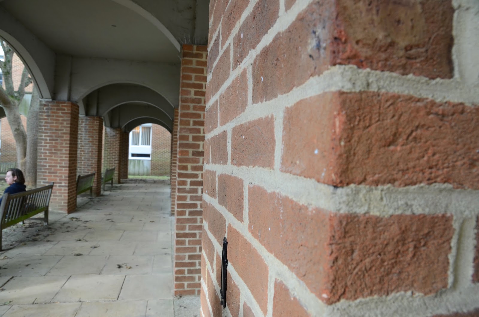
The use of architectural and tree compositions allowed me to experiment with aperture and shutter speed adjustments to experiment with the focus between the foreground and the background. Notice some photos of similar compositions are darker than others and this could have called for an adjustment in the IOS setting or even flash in more extreme darker environment, but I do feel in some of these photographs more exposure was needed.


These are some wider shots of architecture, experimenting with aperture to accomplish focus within the photograph. When starting off I found a good technique is to decide a focus point before taking the photo and this gives you something to work around.To improve these photographs I would slightly adjust the IOS setting as I feel the shadowing in the photo has made the whole image quite dark, so more exposure was needed and I would consider using flash to highlight the architectural qualities better. I would also adjust the shutter speed to a faster one, as I feel working along the aperture setting I used, the photograph would have been clearer and the slight blurring within the photo tidied up.


Saturday, 15 November 2014

The Bare Basics of a Digital Camera: Exposure

BARE BASICS:

The 3 most important modes of the camera are quite straight forwardly named:
A Mode: Aperture Priority. (good for changing Depth of Field and manually controlling Aperture)
S Mode (also known as T mode): Shutter Priority. (good for freezing or blurring motion and manually controlling shutter speed)
M Mode: Manual Exposure. (maximum control of exposure)


The mode button is located on the top of the camera, and can be changed according to which setting you require.


EXPOSURE:

Exposure: The act of exposing image sensor to light.

We control this by controlling the amount of light we let into the lens.

Aperture:

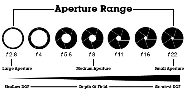
Aperture: is the space in the camera lens which the light passes through, when you adjust the aperture to gain focus, you adjust the amount of light you are allowing through the lens. Aperture controls the brightness of an image.

The Aperture is referred to as the f-stop, and (like the sizing of paper) the smaller the number, the bigger amount of lens is uncovered to allow light through.

SHUTTER SPEED:

Shutter Speed: is the measurement of time the shutter is open.

When capturing a moving object, the shutter speed will be fast to capture a precise image or slower for a more blurred effect.


If the shutter speed is increased by one step, the amount of time the shutter is open is reduced by half.

However, if the shutter speed is decreased by one step, the amount of time the shutter is open is increased by half.

The longer the shutter is open for the more light is is let in, adjusting exposure.

So basically:

Short shutter speed = less light coming in.

Long shutter speed = more light coming in.

DEPTH OF FIELD:

Depth of Field: is  the distance between the nearest and farthest objects in a scene that appear acceptably sharp in an image.


Depth of Field can be controlled using a number of variables such as shutter speed and aperture and IOS setting.

IOS:

IOS: is a measure of the camera's sensibility to light.

The darker the environment being photographed is, the higher the IOS setting needs to be.
On the other hand, the lighter the environment being photographed is, the lower the IOS setting needs to be.

When lighting is poor, flash can be used to light a subject but the drawback to this is flash units have a limited range. So if the IOS is raised the subject and background is able to be exposed well without the need for flash at all.


This diagram may help when trying to locate buttons on the camera (mine being a Nikon D7000) but all have similar layouts.


For any extra information on aperture, shutter speed and camera button functions refer to:

http://www.kenrockwell.com/nikon/d7000/users-guide/controls.htm

http://imaging.nikon.com/history/basics/